

css水平垂直居中总结
在网页布局中,垂直居中对齐总是一个绕不过的话题,而且这两种对齐方式由于浏览器渲染方式的不同,也存在很多不同的场景,本文试图将这些场景一一列举并给出解决方案,也是对这个知识点的一点回顾和总结。
1. 水平居中
水平居中这个问题首先要搞清楚存在两个条件才能够称之为水平居中,即父元素必须是块级盒子容器,父元素宽度必须已经被设定好,在这两个前提下我们来看水平居中问题。
场景 1:子元素是块级元素且宽度没有设定
在这种情况下,实际上也不存在水平居中一说,因为子元素是块级元素没有设定宽度,那么它会充满整个父级元素的宽度,即在水平位置上宽度和父元素一致
html 代码
<div class="wrap">
   <div class="non-child">
      non-child
   </div>
</div>
css 代码:
.wrap{ width: 300px; height: 200px; border: 2px solid #ccc; box-sizing: border-box;}<span style="color: rgba(128, 0, 0, 1)"> .non-child</span>{<span style="color: rgba(255, 0, 0, 1)"> border</span>:<span style="color: rgba(0, 0, 255, 1)"> 1px solid #000</span>;<span style="color: rgba(255, 0, 0, 1)"> background</span>:<span style="color: rgba(0, 0, 255, 1)"> green</span>; }</pre>
结果:

场景 2:子元素是行内元素,子元素宽度是由其内容撑开的
这种情况下解决方案是给父元素设定 text-align:center;
html 代码:
<div class="wrap center">
    <span class="span">1111</span>
</div>
css 代码
  .wrap{
          width: 300px;
          height: 200px;
          border: 2px solid #ccc;
          box-sizing: border-box;
      }
 .span{
            background: red;
        }
 .center{
            text-align: center;
        }
结果:

场景 3
子元素是块级元素且宽度已经设定
这种情形存在多种解法,下面一一来列举
解法 1:给子元素添加 margin:0 auto;
HTML 代码
<div class="wrap">
    <div class="child auto">
        non-child
    </div>
</div>
css 代码:
.child{
            width: 100px;
            height: 100px;
            background: green;
            box-sizing: border-box;
        }
        .auto{
            margin:0 auto;
        }
   .wrap{
          width: 300px;
          height: 200px;
          border: 2px solid #ccc;
          box-sizing: border-box;
      }
结果

解法 2:通过计算指定父元素的 padding-left 或 padding-right
HTML 代码
<div class="wrap padding">
    <div class="child">
        non-child
    </div>
</div>
css 代码:
 .child{
            width: 100px;
            height: 100px;
            background: green;
            box-sizing: border-box;
        }
 .padding{
            padding-left: 100px;
        }
 .wrap{
          width: 300px;
          height: 200px;
          border: 2px solid #ccc;
          box-sizing: border-box;
      }
结果同上,这里计算父元素 padding-left 或 padding-right 的方法为 (父元素宽度 - 子元素宽度)/2, 注意这里为了计算方便给父元素和子元素都设定了 box-sizing:border-box, 这样设定的宽度就是包含 border+padding+content 整个宽度来计算的,如果不设定 box-sizing:border-box,浏览器默认是认为 content-box, 所以设定的宽度仅包含 content 的宽度,在这种情况下,计算父容器的 padding-left 或 padding-right 的方式就是 [(父容器 content 宽度 + 左右 border 宽度)-( 子容器 content 宽 + 水平 padding 宽 + 左右 border 宽)]/2, 可以看到较为麻烦,所以这里建议让父元素和子元素都采取 border-box.
解法 3:计算得到子元素的 margin-left 或 margin-right
html 代码
<div class="wrap">
    <div class="child margin">
        non-child
    </div>
</div>
css 代码
 .child{
            width: 100px;
            height: 100px;
            background: green;
            box-sizing: border-box;
        }
 .margin{
            margin-left:100px;
        }
 .wrap{
          width: 300px;
          height: 200px;
          border: 2px solid #ccc;
          box-sizing: border-box;
      }
结果同上,这里计算子元素 margin-left 或 margin-right 的方法同上。
解法 4:
通过子元素相对父元素绝对定位
html 代码
<div class="relative">
    <div class="child absolute">
        non-child
    </div>
</div>
css 代码
 .relative{
            width: 300px;
            height: 200px;
            border: 2px solid #ccc;
            box-sizing: border-box;
            position: relative;
        }
        .absolute{
            position: absolute;
            left:50%;
            margin-left:-50px;
        }
   .child{
            width: 100px;
            height: 100px;
            background: green;
            box-sizing: border-box;
        }
结果同上,这里还要设定子元素 margin-top 为 -50 是需要消除父元素 50% 造成的偏移
解法 5:利用 flex-box
HTML 代码
<div class="flex">
    <div class="child">
        non-child
    </div>
</div>
css 代码
.flex{ width: 300px; height: 200px; border: 2px solid #ccc; box-sizing: border-box; display:flex; flex-direction: row; justify-content:center;}<span style="color: rgba(128, 0, 0, 1)">.child{
width: 100px;
height: 100px;
background: green;
box-sizing: border-box;
}
结果同上
2. 垂直居中
和水平居中一样,这里要讲垂直居中,首先设定两个条件即父元素是盒子容器且高度已经设定
场景 1:子元素是行内元素,高度是由其内容撑开的
这种情况下,需要通过设定父元素的 line-height 为其高度来使得子元素垂直居中
html 代码
<div class="wrap line-height">
    <span class="span">111111</span>
</div>
css 代码
 .wrap{
            width:200px ;
            height: 300px;
            border: 2px solid #ccc;
            box-sizing: border-box;
        }
        .span{
            background: red;
        }
        .line-height{
            line-height: 300px;
        }
结果

场景 2:子元素是块级元素但是子元素高度没有设定,在这种情况下实际上是不知道子元素的高度的,无法通过计算得到 padding 或 margin 来调整,但是还是存在一些解法。
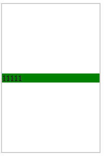
解法 1:通过给父元素设定 display:table-cell;vertical-align:middle 来解决
html 代码
<div class="wrap table-cell">
    <div class="non-height">11111</div>
</div>
css 代码
  .table-cell{
            display: table-cell;
            vertical-align: middle;
        }
 .non-height{
            background: green;
        }
.wrap{
            width:200px ;
            height: 300px;
            border: 2px solid #ccc;
            box-sizing: border-box;
        }
结果
解法 2:flexbox
html 代码
<div class="wrap flex">
    <div class="non-height">1111</div>
</div>
css 代码
 .wrap{
            width:200px ;
            height: 300px;
            border: 2px solid #ccc;
            box-sizing: border-box;
        }
.non-height{
            background: green;
        }
 .flex{
            display: flex;
            flex-direction: column;
            justify-content: center;
        }
结果同上
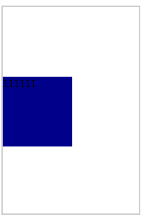
场景 3:子元素是块级元素且高度已经设定
解法 1:
计算子元素的 margin-top 或 margin-bottom,计算方法为父 (元素高度 - 子元素高度)/2
html 代码
<div class="wrap">
    <div class="div1 margin">111111</div>
</div>
css 代码
  .wrap{
            width:200px ;
            height: 300px;
            border: 2px solid #ccc;
            box-sizing: border-box;
        }
.div1{
            width:100px ;
            height: 100px;
            box-sizing: border-box;
            background: darkblue;
        }
        .margin{
          margin-top: 100px;
        }
结果
解法 2:计算父元素的 padding-top 或 padding-bottom,计算方法为 (父元素高度 - 子元素高度)/2
html 代码
<div class="wrap  padding">
    <div class="div1">111111</div>
</div>
css 代码
 .wrap{
            width:200px ;
            height: 300px;
            border: 2px solid #ccc;
            box-sizing: border-box;
        }
 .padding{
            padding-top: 100px;
        }
.div1{
            width:100px ;
            height: 100px;
            box-sizing: border-box;
            background: darkblue;
        }
结果同上
解法 3:利用绝对定位,让子元素相对于父元素绝对定位
html 代码
<div class="wrap  relative">
    <div class="div1 absolute">111111</div>
</div>
css 代码
 .relative{
            position: relative;
        }
        .absolute{
            position: absolute;
            top:50%;
            margin-top: -50px;
        }
.wrap{
            width:200px ;
            height: 300px;
            border: 2px solid #ccc;
            box-sizing: border-box;
        }
.div1{
            width:100px ;
            height: 100px;
            box-sizing: border-box;
            background: darkblue;
        }
结果同上
解法 4:利用 flexbox
html 代码
<div class="wrap  flex">
    <div class="div1">111111</div>
</div>
css 代码
.flex{
            display: flex;
            flex-direction: column;
            justify-content: center;
        }
.wrap{
            width:200px ;
            height: 300px;
            border: 2px solid #ccc;
            box-sizing: border-box;
        }
.div1{
            width:100px ;
            height: 100px;
            box-sizing: border-box;
            background: darkblue;
        }
结果同上